Rest
Visual Identity / Product Experience / Web Design
Rest is a sleep wellness app created for women experiencing insomnia and emotional exhaustion.
At the center of the experience is Leslie — a warm, familiar character designed to make first-time users feel safe and understood. The visual language avoids polished perfection in favor of softness, authenticity, and quiet comfort.
Through illustrations, social storytelling, and calming digital interactions, the brand builds an intimate world centered around rest, vulnerability, and emotional care.
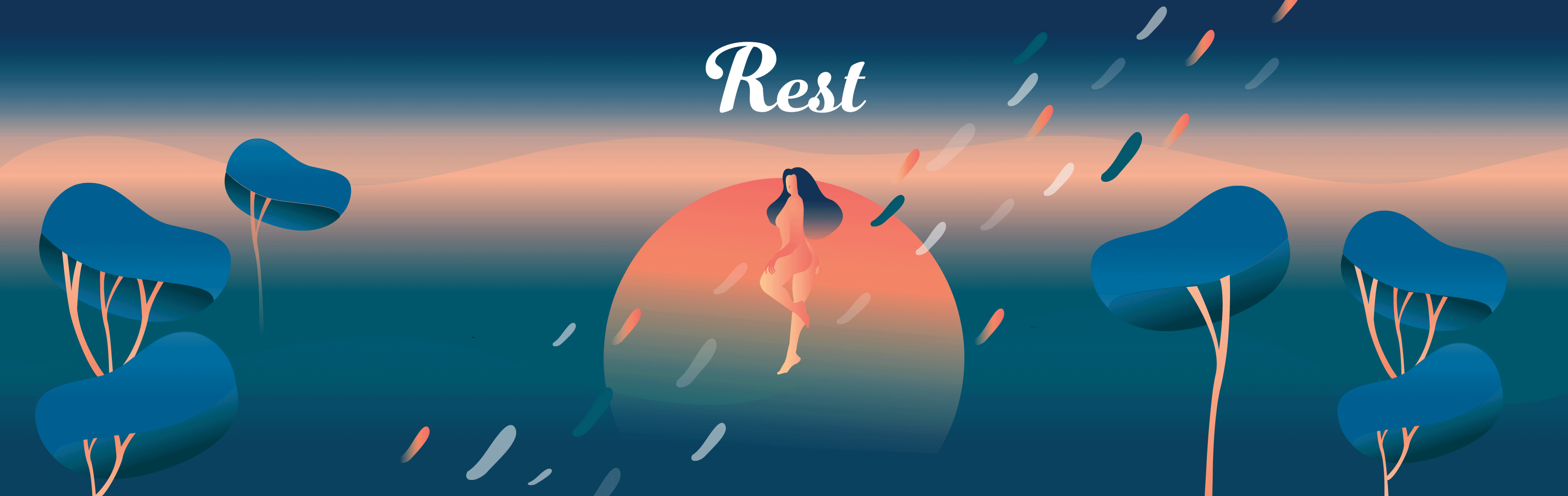
Banner
Logo
The logo was designed using a soft script typeface to evoke warmth and emotional ease.
While many sleep-related apps rely on indigo tones to represent nighttime, Rest reinterprets the night through deep turquoise — creating a calmer and more poetic atmosphere.

Visual Identity
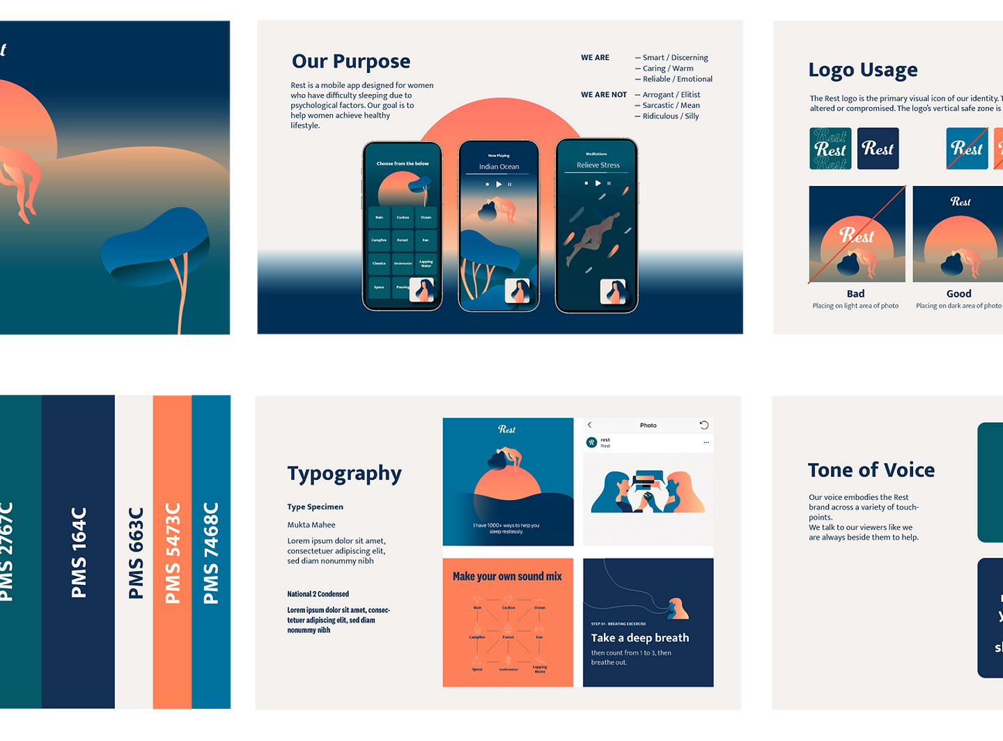
Iconography
Every icon was distilled to its most essential form, reinforcing the app’s calm and distraction-free atmosphere.
Concept
The experience was built around the idea of quiet companionship. Rather than functioning as a purely informational interface, the app introduces Leslie as an ever-present emotional guide — creating warmth, familiarity, and comfort throughout the digital experience.

App Store Screenshots

Landing Page
